A little motion. A little more room.
Keeping the Aqua feeling, while making the page quieter and the small interactions more considered.

I still like interfaces that feel like objects. A soft edge. A little reflection. A button that looks like it wants to be pressed.
That is what draws me to Aqua. There is warmth in it.
But I do not want this website to feel like a collection of effects. I want it to feel like a place where you can find my work and read something without fighting the page.
Keep the character
The blue stays. So do the rounded windows and the glass details. The changes are in how they share the page: more breathing room, calmer surfaces, and a clearer order.
I like a small glow when the pointer passes over a card. I like a section arriving gently as I scroll. These details work best when they stay in the background.
Let the reader set the pace
Smooth movement should still feel responsive. Touch scrolling should feel familiar. And if someone has asked their device for less motion, the page should respect that choice.
Those are small decisions, but they matter more to me than adding one more animation.
The best detail is often the one that makes everything else feel easier.
Give the words some space
The journal is part of the same idea. Comfortable type, useful headings, an image where it belongs, and a clear link to share the post.
Nothing complicated. Just a little more care in the places people actually use.
Keep exploring
Another thought or two.

Sentinel-VC is out in the open.
An open-source project, a research preprint, and a small step toward more thoughtful Telegram moderation.
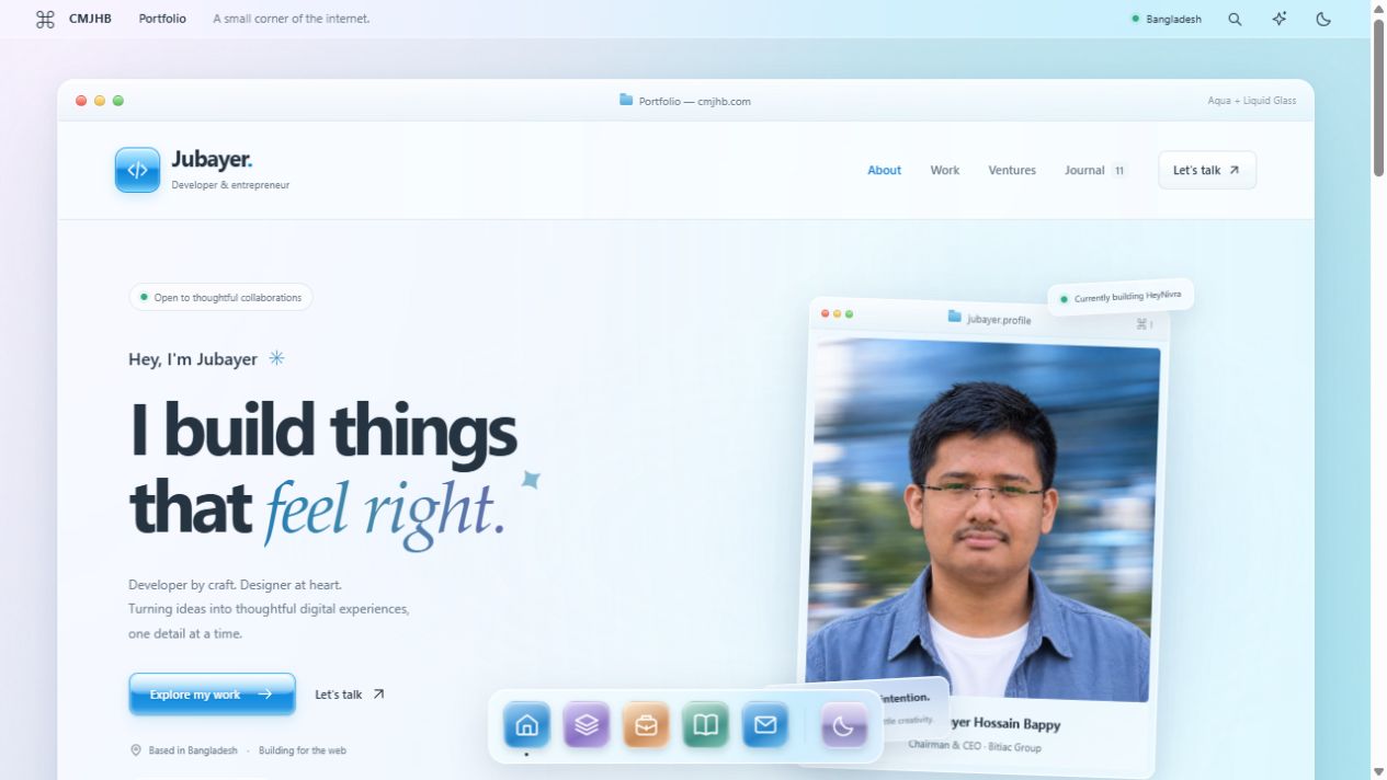
Less noise. More glass.
A little Aqua nostalgia. A little light through glass. I rebuilt my corner of the internet to feel softer, simpler, and more like me.
Good architecture starts with fewer moving parts.
A practical way to think about systems: start with the problem, keep the boundaries clear, and earn the complexity.